As I stated in my July 12, 2010 post (“ECRI WLI Growth History“):
For a variety of reasons, I am not as enamored with ECRI’s WLI and WLI Growth measures as many are.
However, I do think the measures are important and deserve close monitoring and scrutiny.
The movement of the ECRI WLI and WLI, Gr. is particularly notable at this time, as ECRI publicly announced on September 30, 2011 that the U.S. was “tipping into recession,” and ECRI has reaffirmed that view since, with the most recent statement on March 15 (“Why Our Recession Call Stands.”)
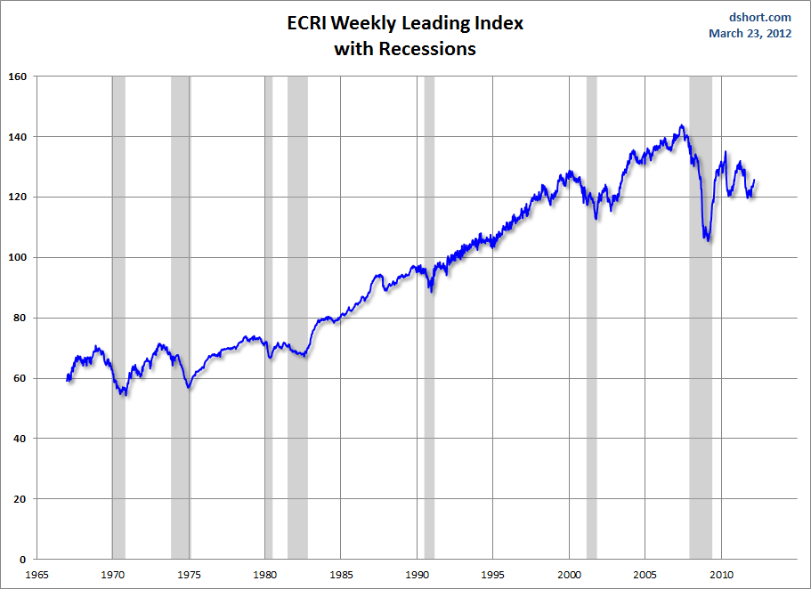
Below is a long-term chart, on a weekly basis through the March 23 release (data through March 16 with current value of 125.7), of the ECRI WLI (defined at ECRI’s glossary) from Doug Short’s blog post of March 23 titled “ECRI Indicators Improve, But Beware the ‘Yo-Yo Years‘” :
(click on charts to enlarge images)
–
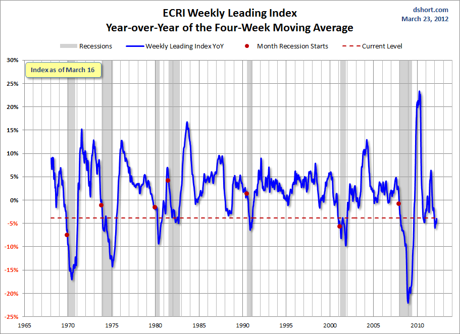
This next chart depicts, on a long-term basis, the year-over-year change in the 4-week moving average of the WLI through the March 23 release (data through March 16):
–
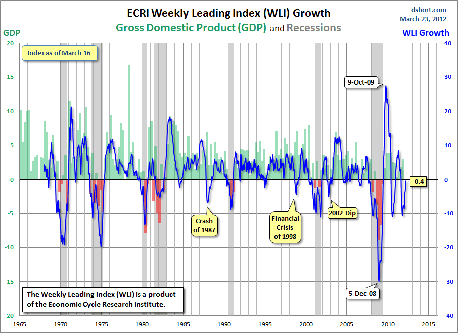
This last chart depicts, on a long-term basis, the WLI, Gr. through the March 23 release (data through March 16):
_________
I post various economic indicators and indices because I believe they should be carefully monitored. However, as those familiar with this blog are aware, I do not necessarily agree with what they depict or imply.
_____
The Special Note summarizes my overall thoughts about our economic situation
SPX at 1397.11 as this post is written


