As a continuation of the last post, here are three other charts that I find disturbing in nature.
These charts raise a lot of questions. Many of these questions I have discussed in the blog, as I believe they are very significant in nature. Additionally, these charts should highlight the “atypical” nature of our economic situation from a long-term historical perspective.
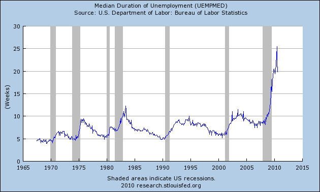
Here is a St. Louis Fed chart depicting the Median Duration of Unemployment (last updated 9-3-10):
(click on charts to enlarge images)
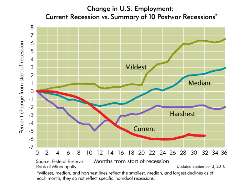
These next two charts are from the Minneapolis Federal Reserve. These charts really provide a perspective on the length and extent of this downturn. The first depicts our Unemployment situation (last updated 9-3-10):
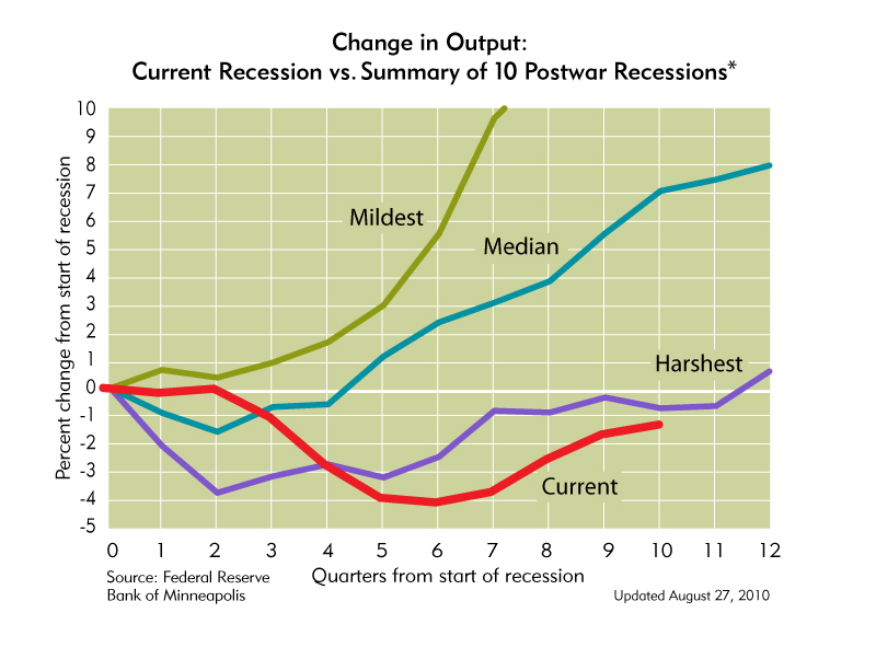
This depicts Output (last updated 8-27-10):
A Special Note concerning our economic situation is found here
SPX at 1129.01 as this post is written


