In the next two posts, I am going to display various charts that I find disturbing. These charts would be disturbing at any point in the economic cycle; that they depict such a tenuous situation now – nearly a year into what most believe is an economic recovery – is especially notable.
Many more such charts exist, unfortunately. I regularly discuss many troubling characteristics of our economy in this blog.
As well, I find many aspects of the financial markets to be problematical. These aspects are frequently discussed.
All of these charts are from The Federal Reserve, and represent the most recently updated data. I especially find these charts valuable as they depict our current situation in a longer-term historical context.
Charts in this post are from the St. Louis Federal Reserve. Here are the charts:
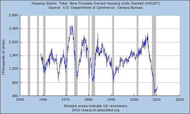
Housing starts (last updated 5-18-10):
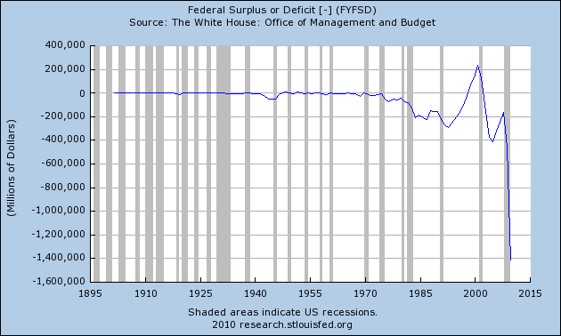
The Federal Deficit (last updated 3-8-10):
Federal Net Outlays (last updated 3-8-10):
State & Local Personal Income Tax Receipts (% Change from Year Ago)(last updated 3-26-10):
Total Loans and Leases of Commercial Banks (% Change from Year Ago)(last updated 6-7-10):
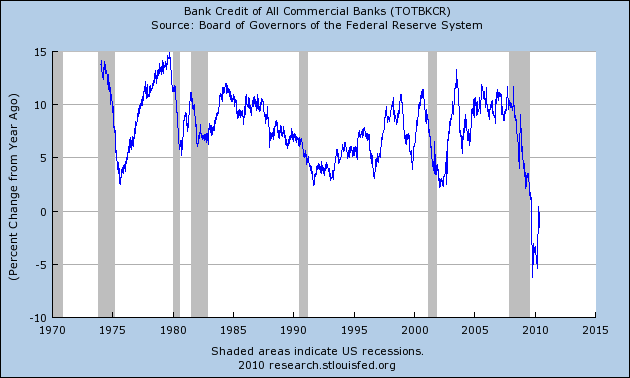
Bank Credit – All Commercial Banks (Percent Change from Year Ago)(last updated 6-7-10):
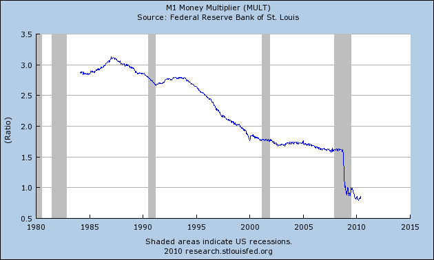
M1 Money Multiplier (last updated 5-27-10):
Now, onto Part II – unemployment and output…
SPX at 1050.47 as this post is written


I am a researcher – thanks for these horrifying graphs. I have been laid off myself and am living this nightmare. I do believe the American public should somehow see these because we all need to be prepared. Thanks.