As a continuation of yesterday’s post, here are three other charts that I find disturbing in nature.
These charts raise a lot of questions. Many of these questions I have discussed in the blog, as I believe they are very significant in nature. Additionally, these charts should highlight the “atypical” nature of our economic situation from a long-term historical perspective.
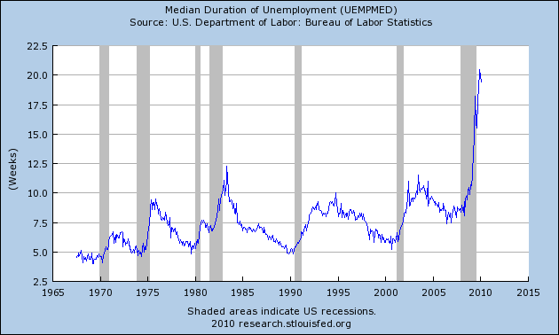
Here is a St. Louis Fed chart depicting the Median Duration of Unemployment:
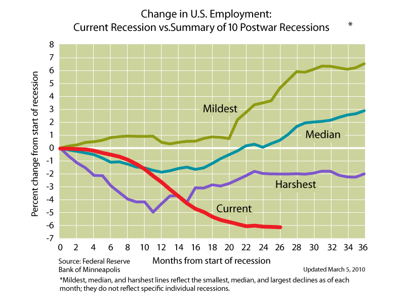
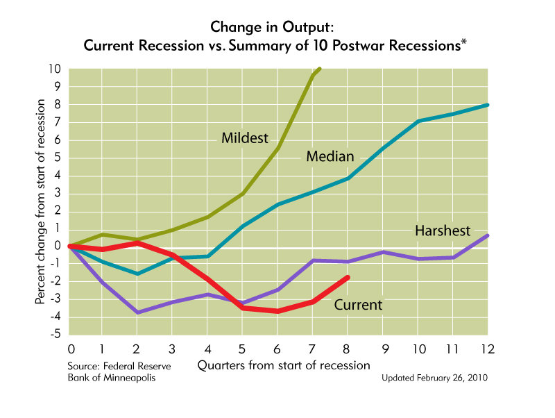
These next two charts are from the Minneapolis Federal Reserve. These charts really provide a perspective on the length and extent of this downturn. The first depicts our Unemployment situation:
This depicts Output:
More about these last two charts can be found in this previous blog post.
back to <home>
SPX at 1175.44 as this post is written


