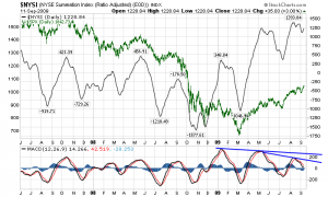
Moving on to the stock market… The first chart is the NYSE Summation Index. I have put in the S&P500 as an overlay in green, with the NYSE Summation Index’s MACD at the bottom of the chart. What I find interesting here is the negative MACD divergence as indicated on the chart, in blue:

Chart Courtesy of StockCharts.com
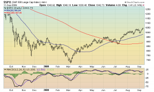
Next, a view of the S&P500 daily chart. I have included the 50 and 200 day moving averages, in blue and red respectively. Also, on the bottom of the chart I have included the MACD. If one looks at this chart casually, as presented there doesn’t seem to be any problems, with the possible exception of the MACD. Otherwise, it seems to be a strong, steady rally…one that seems to “fit” with the economic recovery scenario that almost all economists and other forecasters are predicting (these forecasts are extensively documented on this blog, and can be found under the “Economic Forecasts” Category listed on the right side of the home page).
However, as I will explain in the next post, upon closer examination, the S&P500’s price action may be far more troubling than it casually appears…

Chart Courtesy of StockCharts.com
Now on to Part IV…
SPX at 1042.73 as this post is written…