This post is an update to past posts regarding stock market volatility.
While I track many different measures of volatility, I find the following charts to be both simple and clear in depicting the recent volatility in the stock market.
Overall, my analyses indicates that there are many reasons for this volatility, and the volatility is highly significant.
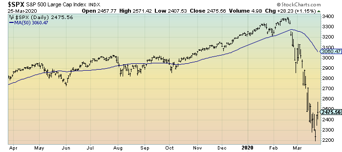
First, a one-year daily depiction of the S&P500 through Wednesday’s (March 25, 2020) close, with a 50-day moving average (MA50) depicted by the blue line:
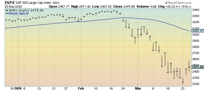
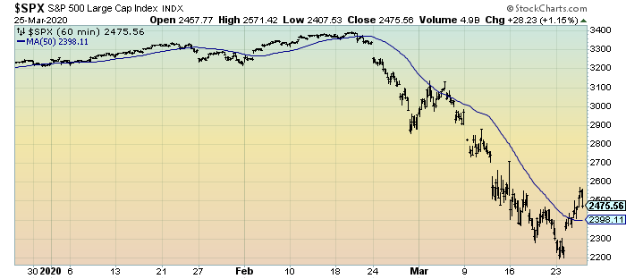
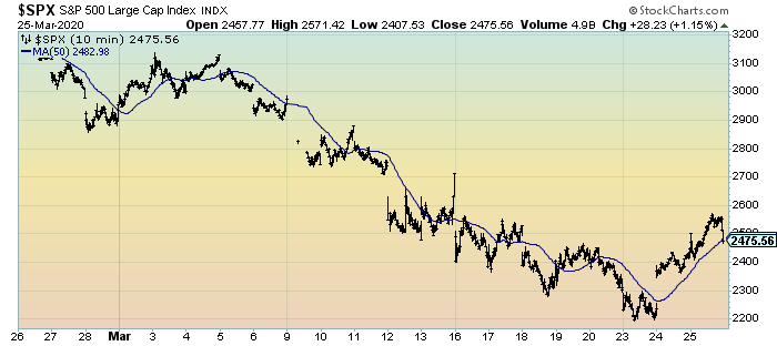
(click on chart to enlarge image)(charts courtesy of StockCharts.com)
Second, a three-month daily depiction of the S&P500 through Wednesday’s (March 25, 2020) close, with a 50-day moving average (MA50) depicted by the blue line:
Third, a three-month depiction of the S&P500 in 60-minute intervals through Wednesday’s (March 25, 2020) close, with a 50-hour moving average (MA50) depicted by the blue line:
Fourth, a one-month depiction of the S&P500 in 10-minute intervals through Wednesday’s (March 25, 2020) close, with a 50-period moving average (MA50) depicted by the blue line:
_____
The Special Note summarizes my overall thoughts about our economic situation
SPX at 2475.56 as this post is written