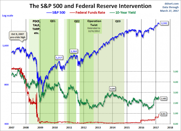
In the August 9, 2011 post (“QE3 – Various Thoughts“) I posted a chart that depicted the movements of the S&P500, 10-Year Treasury Yield and the Fed Funds rate spanning the periods of various Federal Reserve interventions since 2007.
For reference purposes, here is an updated chart (through March 27, 2017) from Doug Short’s blog post of March 27 (“Treasury Snapshot: 10-Year Note at 2.38“):
_____
The Special Note summarizes my overall thoughts about our economic situation
SPX at 2359.64 as this post is written