I find the following charts to be disturbing. These charts would be disturbing at any point in the economic cycle; that they (on average) depict such a tenuous situation now – 61 months after the official (as per the September 20, 2010 NBER BCDC announcement) June 2009 end of the recession – is especially notable.
These charts raise a lot of questions. As well, they highlight the “atypical” nature of our economic situation from a long-term historical perspective.
All of these charts are from the Federal Reserve, and represent the most recently updated data.
The following nine charts are from the St. Louis Federal Reserve:
(click on charts to enlarge images)
Housing starts (last updated 6-17-14):
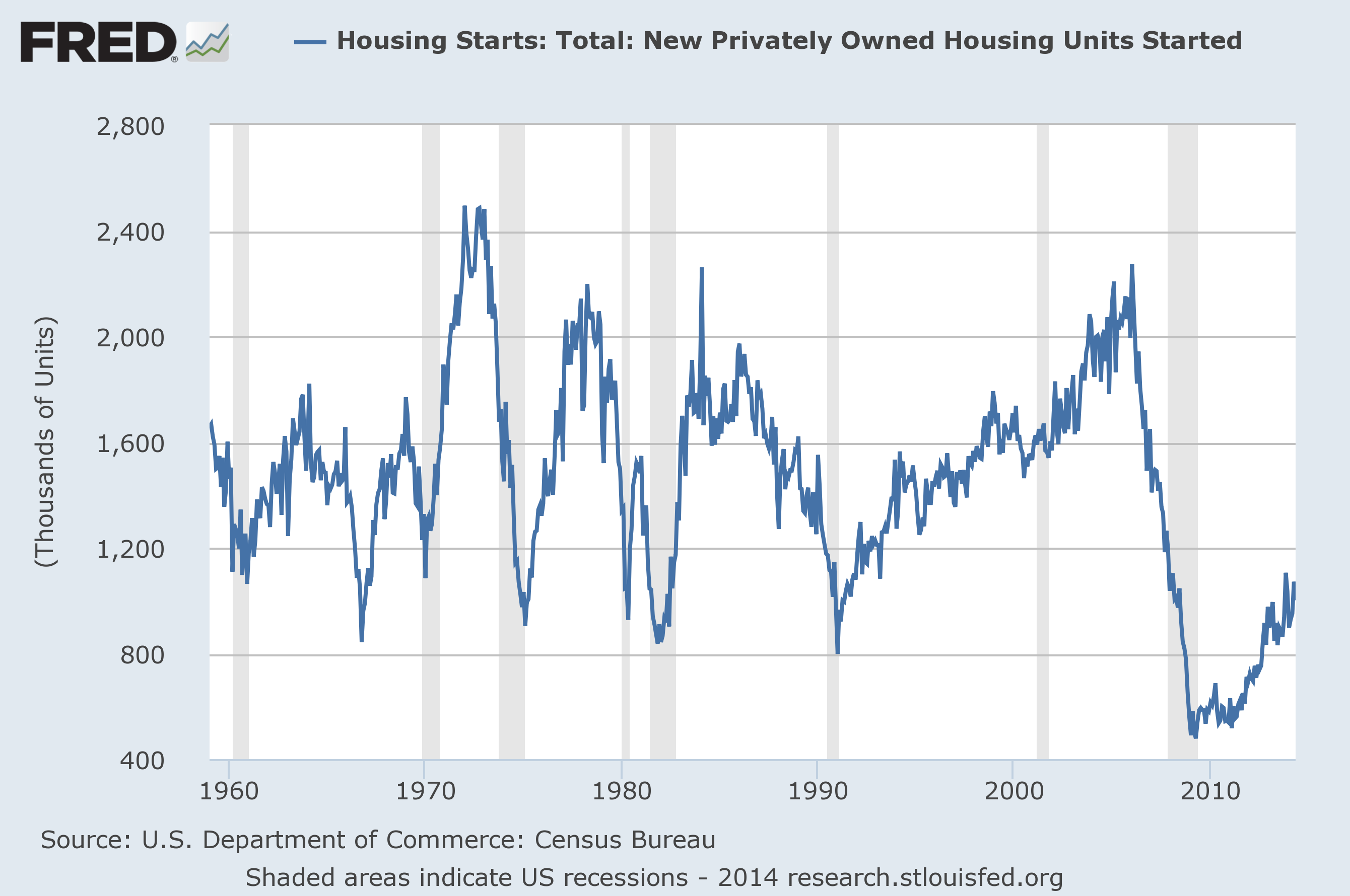
–
The Federal Deficit (last updated 3-14-14):
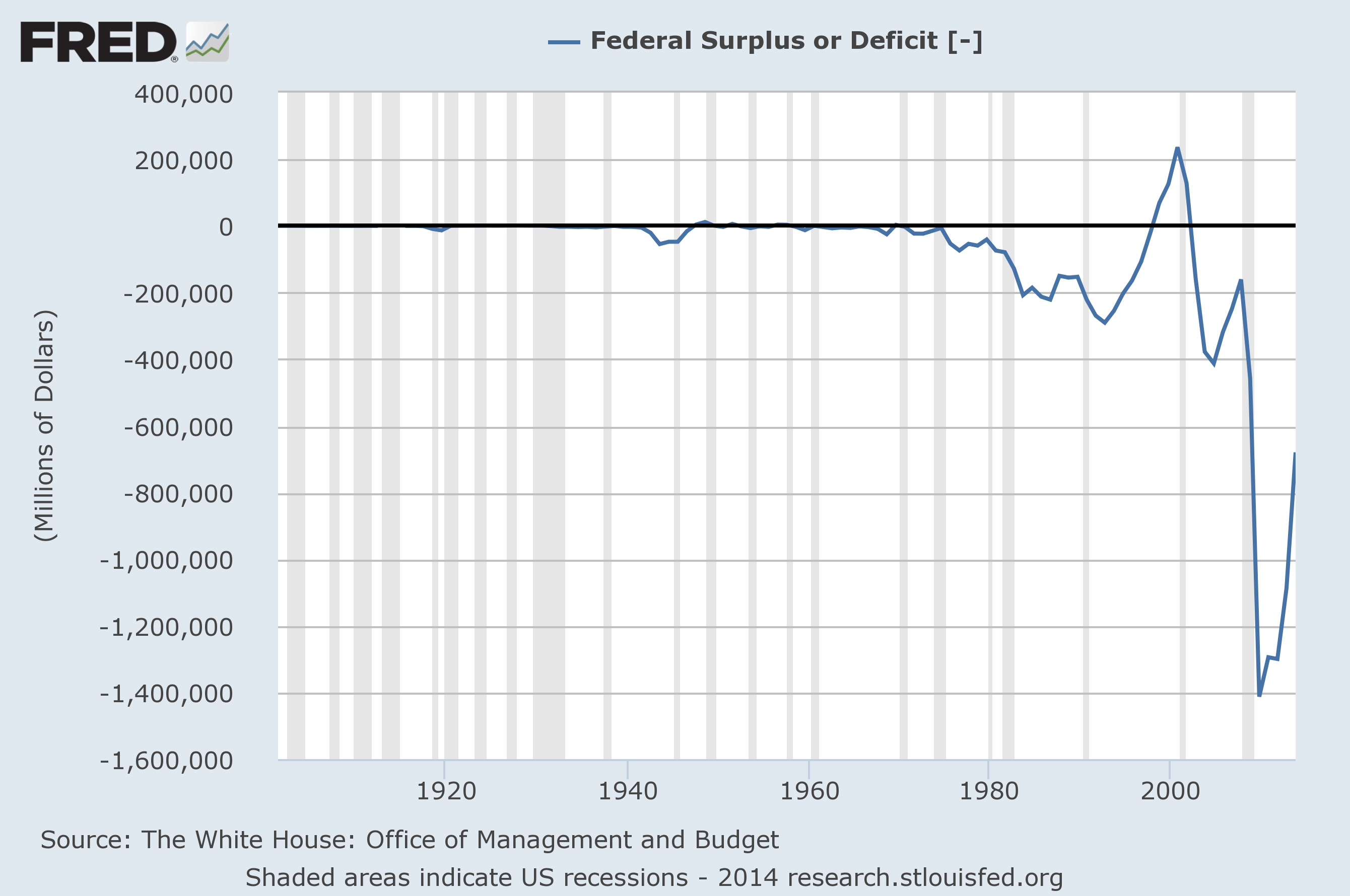
–
Federal Net Outlays (last updated 3-14-14):
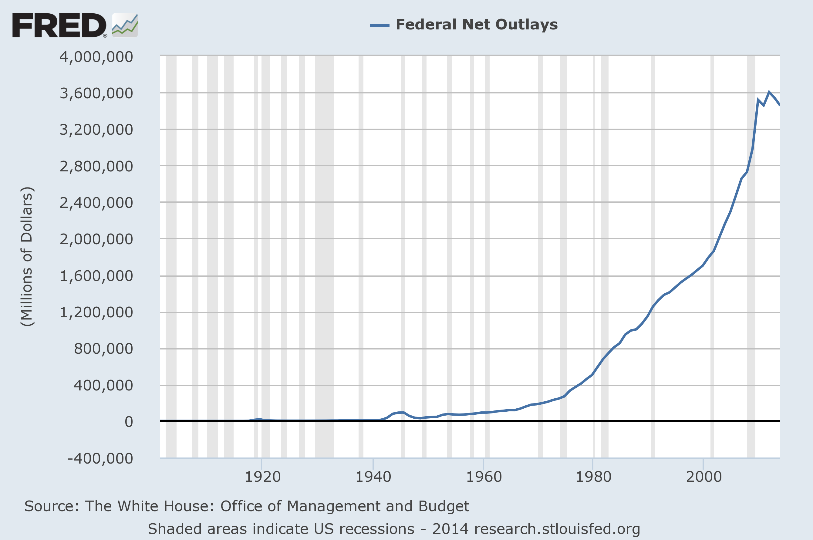
–
State & Local Personal Income Tax Receipts (% Change from Year Ago)(last updated 3-27-14):
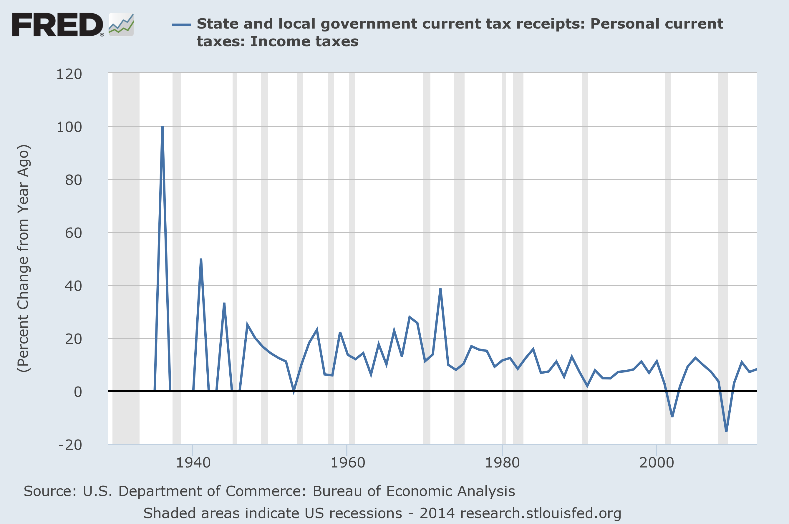
–
Total Loans and Leases of Commercial Banks (% Change from Year Ago)(last updated 7-11-14):
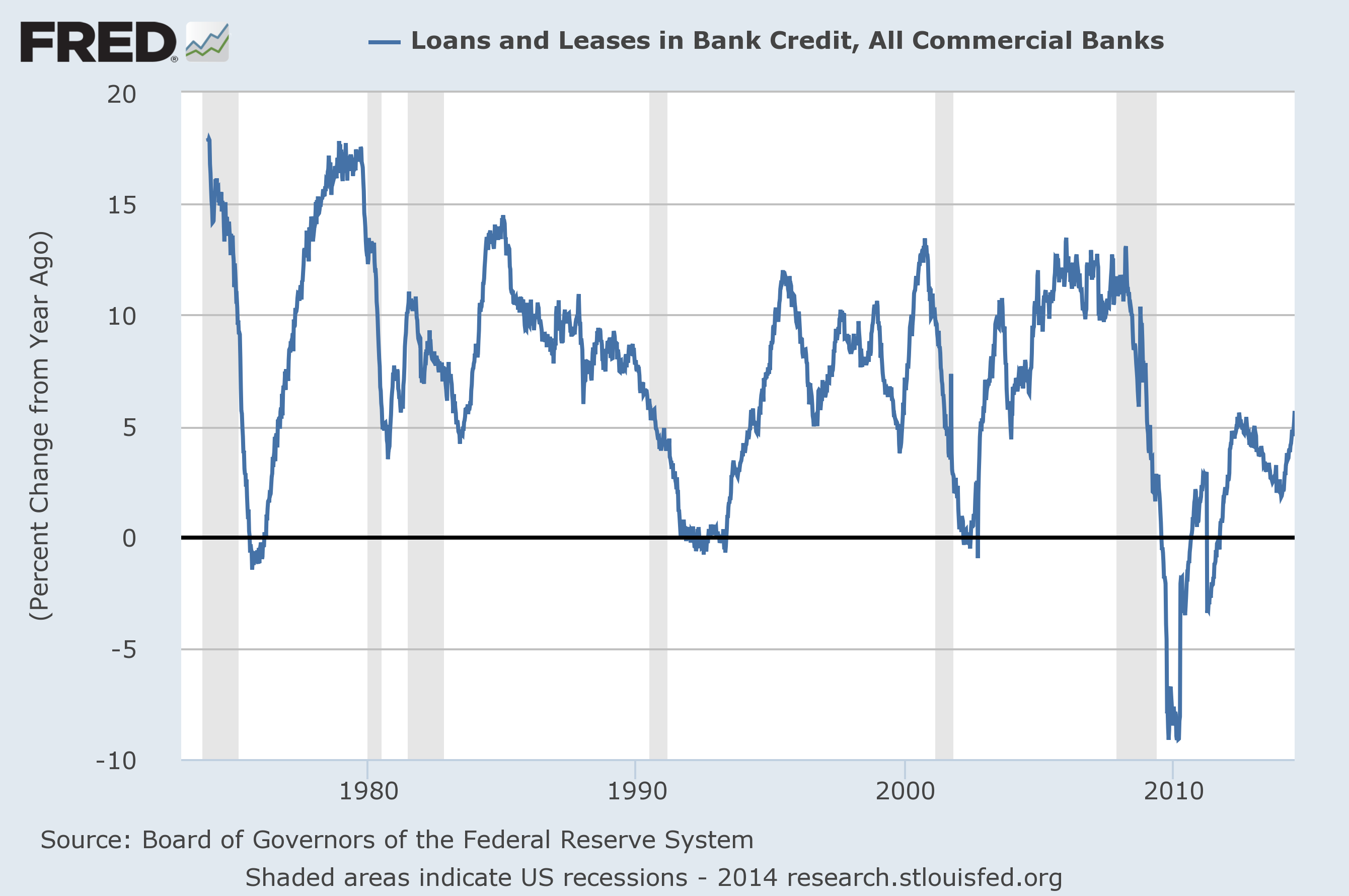
–
Bank Credit – All Commercial Banks (% Change from Year Ago)(last updated 7-11-14):
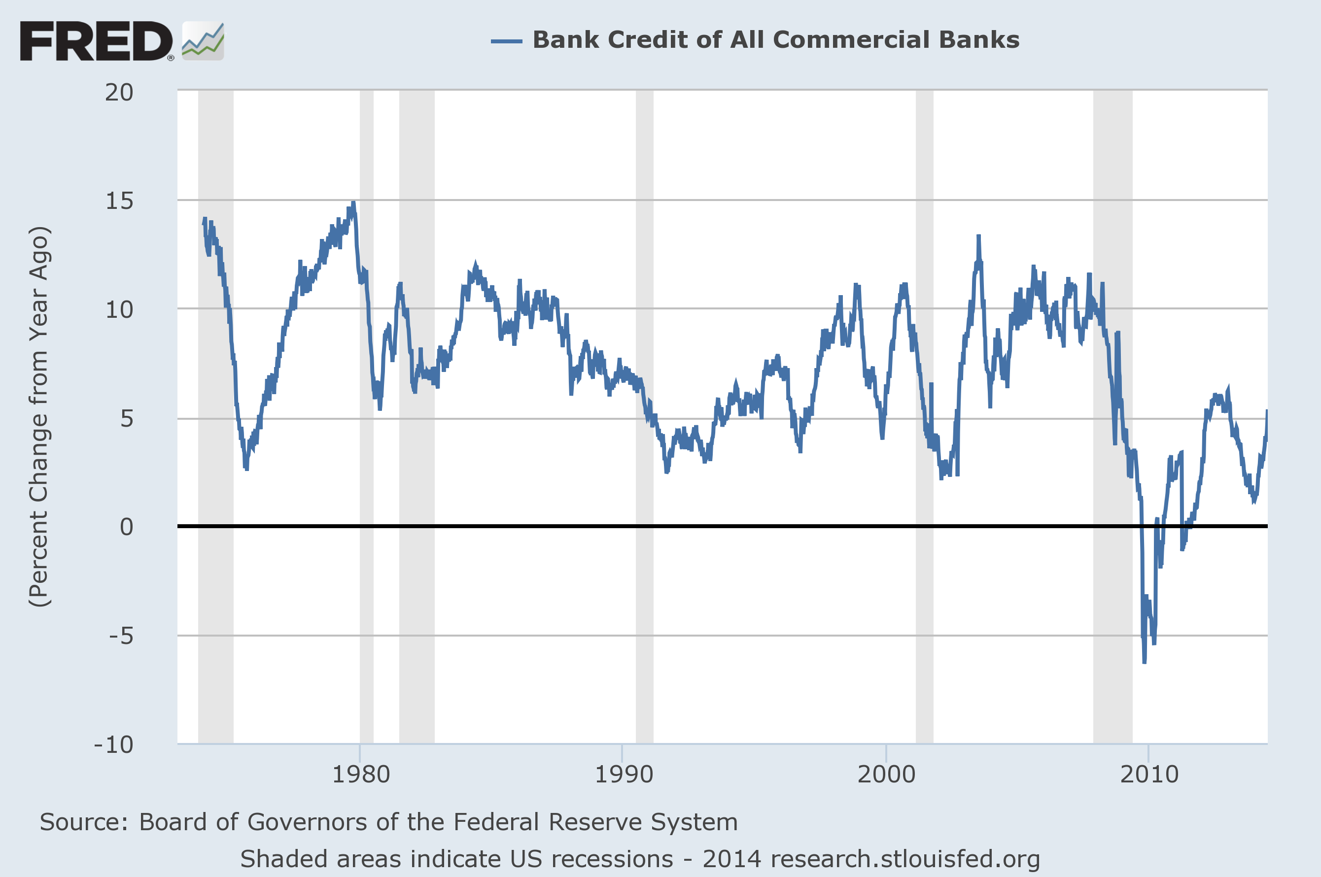
–
M1 Money Multiplier (last updated 7-3-14):
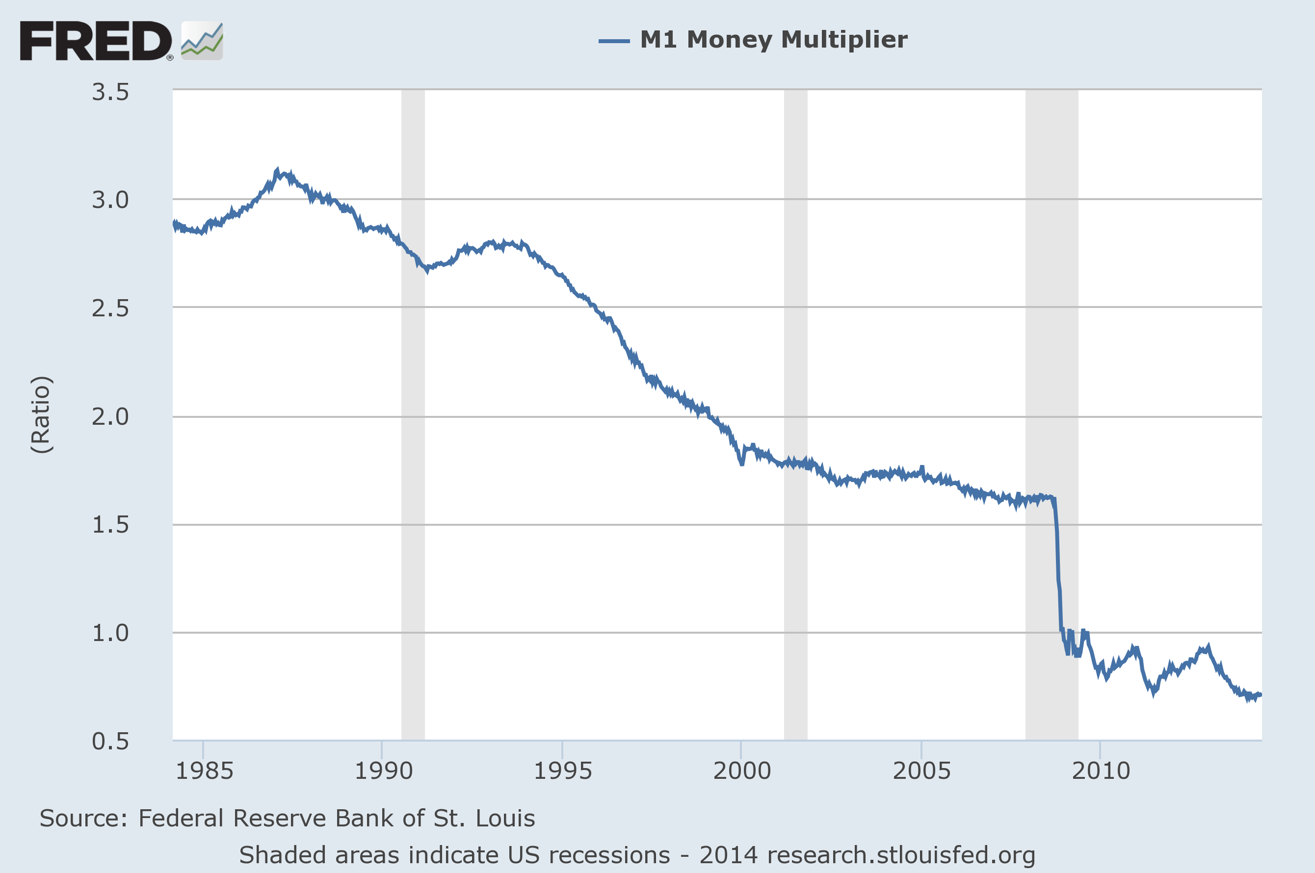
–
Median Duration of Unemployment (last updated 7-3-14):
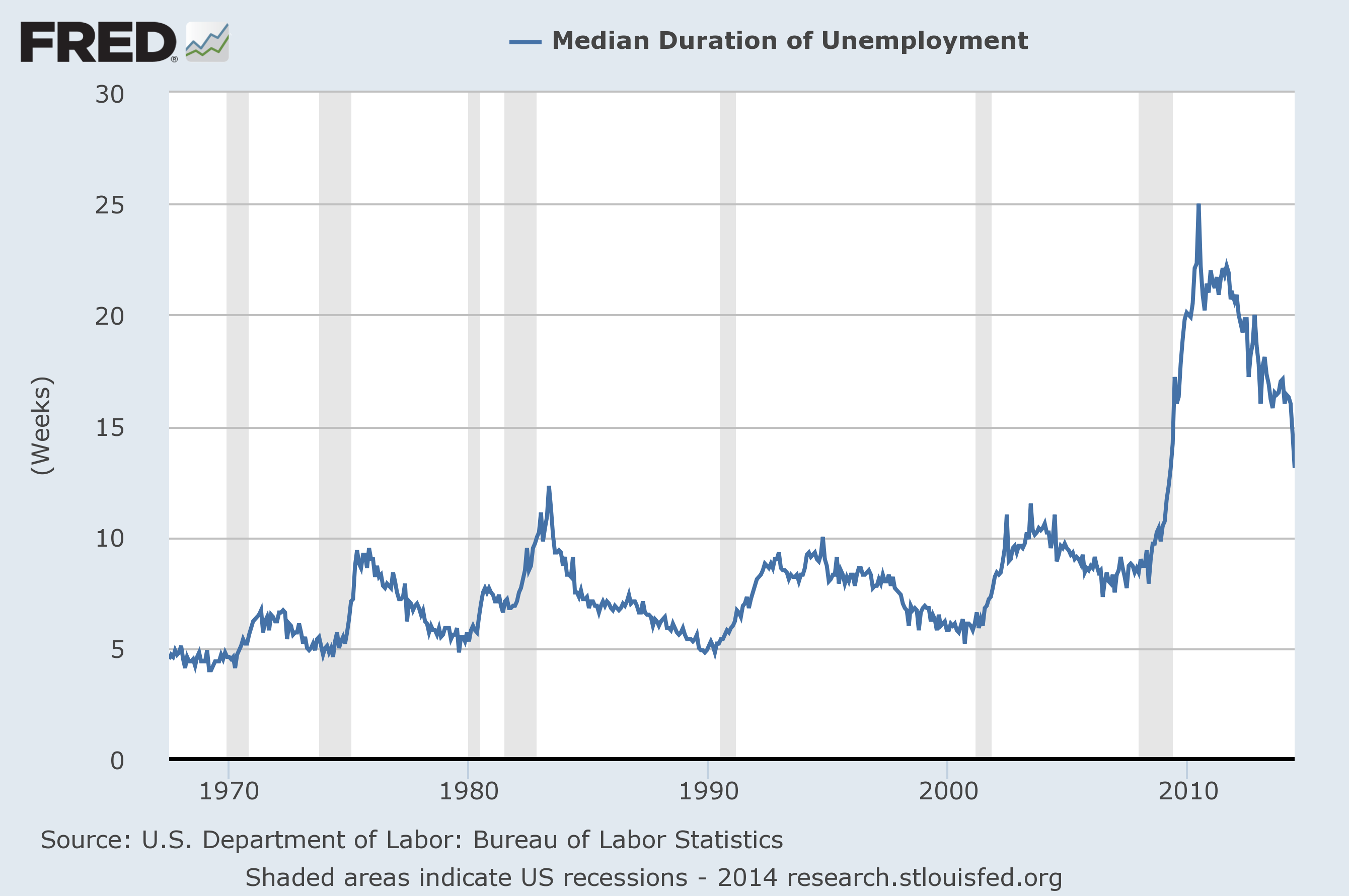
–
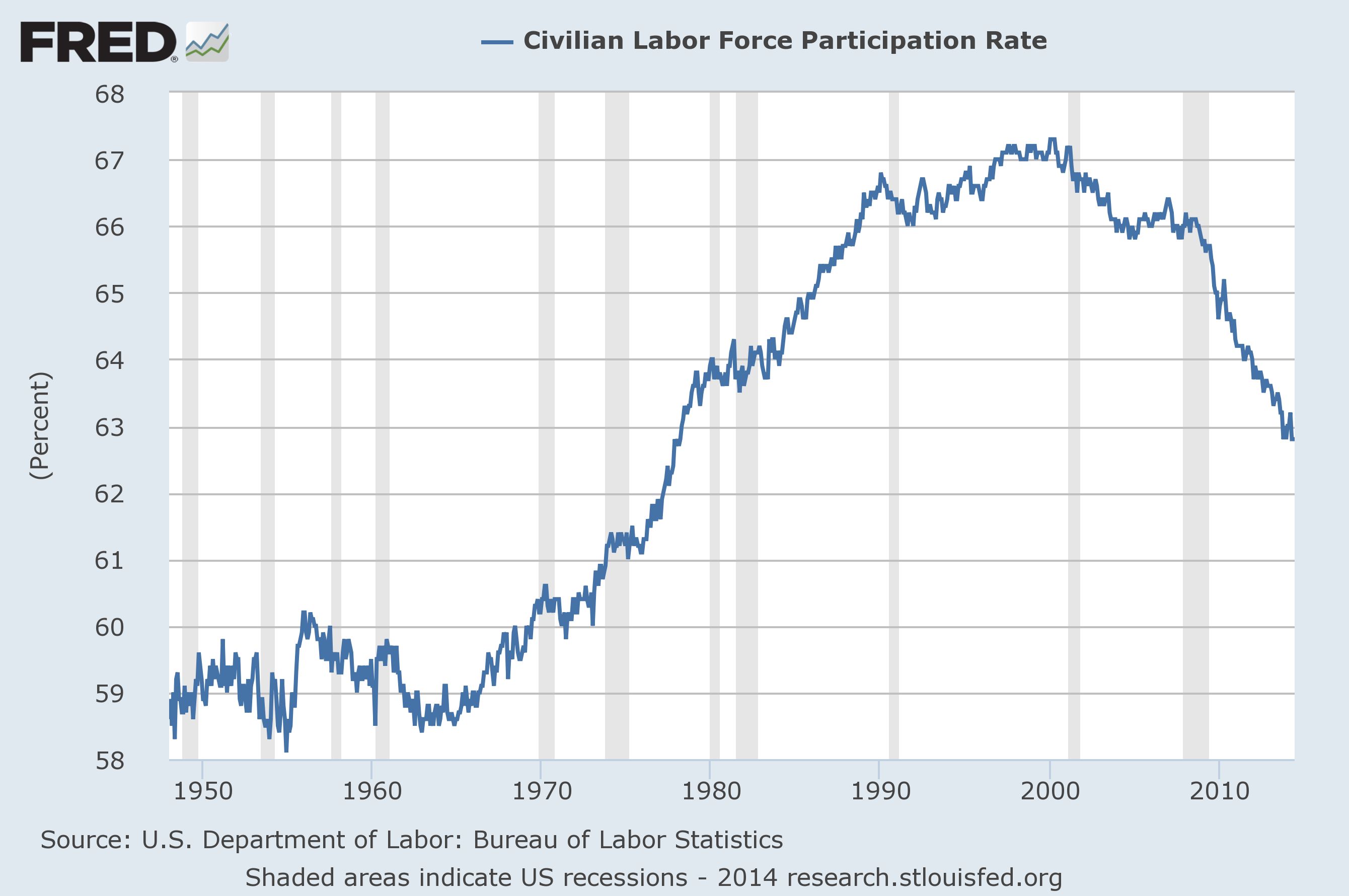
Labor Force Participation Rate (last updated 7-3-14):
–
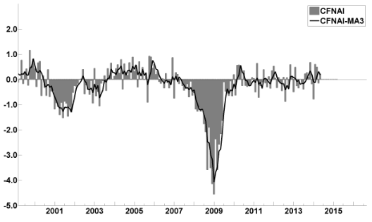
This last chart is of the Chicago Fed National Activity Index (CFNAI, and its 3-month moving average CFNAI-MA3) and it depicts broad-based economic activity (last updated 6-23-14):
–
I will continue to update these charts on an intermittent basis as they deserve close monitoring…
_____
The Special Note summarizes my overall thoughts about our economic situation
SPX at 1973.28 as this post is written