I have written many blog posts concerning the worrisome trends in income and earnings.
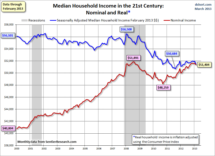
Doug Short, in his March 25 blog post, titled “Real Median Household Incomes: Down $590 in February” produced the chart below. It is based upon data from Sentier Research, and it shows both nominal and real median household incomes since 2000, as depicted. As one can see, post-recession real median household income (seen in the blue line since 2009) is especially worrisome.
(click on chart to enlarge image)
–
As Doug mentions in his aforementioned blog post:
The Sentier Research monthly median household income data series is now available for February. Nominal median household incomes decline 0.5% month-over-month, but are up 2.4% year-over-year. Adjusted for inflation, real incomes fell 1.1% MoM and are essentially flat YoY at 0.4%.
Also seen in his blog post is a chart depicting each of the two (nominal and real household incomes) data series’ percent change over time since 2000.
_____
The Special Note summarizes my overall thoughts about our economic situation
SPX at 1551.69 as this post is written