In the September 20, 2010 post I first highlighted the lack of significant long-term growth in Real Median Income.
Doug Short, in his September 18 blog post titled “U.S. Household Incomes: A 44-Year Perspective,” has a variety of charts and commentary on various facets of Household Income distributions and growth.
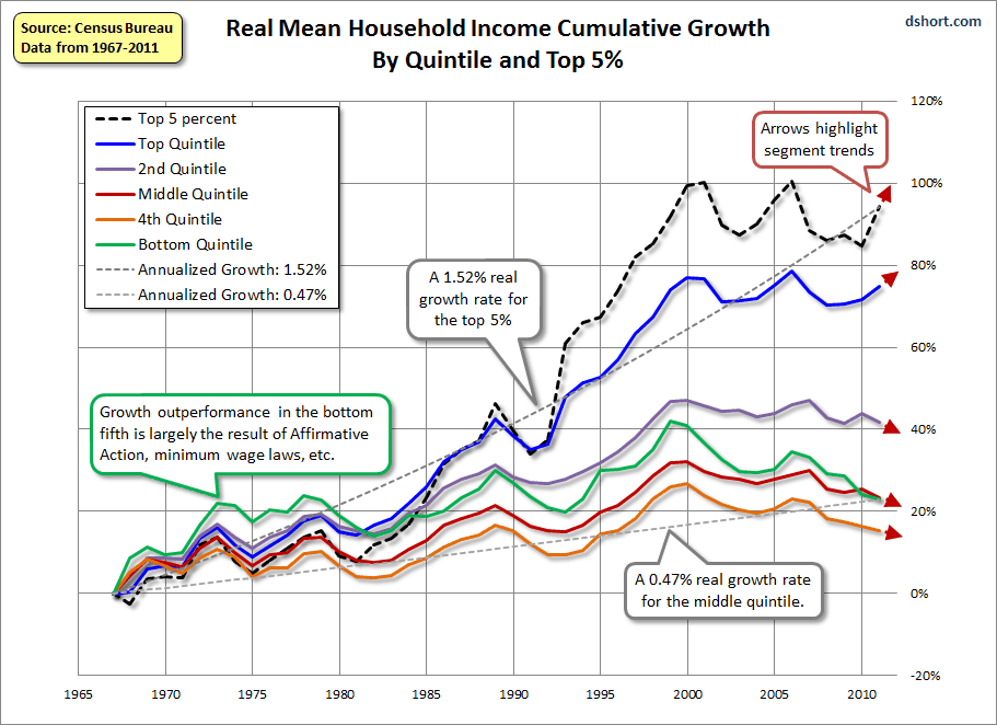
One chart, seen below, seems particularly interesting. It is a depiction of Real Mean Household Income Cumulative Growth By Quintile and Top 5%, from 1967 to 2011:
(click on chart to enlarge image)
–
In a different post on September 18, Doug also had another notable post concerning household incomes, this one categorized by age brackets. That post is titled “U.S. Median Households Incomes by Age Bracket: 2011 Was a Bleak Year.”
_____
The Special Note summarizes my overall thoughts about our economic situation
SPX at 1465 as this post is written
