Three years ago today the S&P500 made its daily low close of 676.53. (It made the ultimate intraday low of 666.79 on the prior trading day, March 6, 2009). Many, including myself, consider March 9, 2009 as the start of this stock market advance.
There are two charts I would like to highlight as reference; I may further comment on them at a later date.
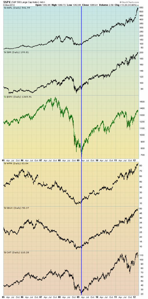
The first is a daily chart of the S&P500 (shown in green), as well as five (AAPL, IBM, WFM, SBUX, CAT) individual stocks, since 2005. There is a blue vertical line that is very close to the March 6, 2009 low. As one can see, both the S&P500 performance, as well as many stocks including the five shown, has been strong since the March 6, 2009 low:
(click on chart to enlarge image)(chart courtesy of StockCharts.com; chart creation and annotation by the author)
–
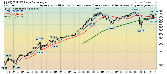
This next chart shows, on a monthly LOG basis, the S&P500 since 1980. I find this chart notable as it provides an interesting long-term perspective on the S&P500’s performance. The 20, 50, and 200-month moving averages are shown in blue, red, and green lines, respectively:
(click on chart to enlarge image)(chart courtesy of StockCharts.com; chart creation and annotation by the author)
_____
The Special Note summarizes my overall thoughts about our economic situation
SPX at 1365.91 as this post is written

