In previous posts I have discussed the Bond Bubble and its many facets. In particular, I would like to highlight my post of October 4 2010, “Thoughts On The Bond Bubble.”
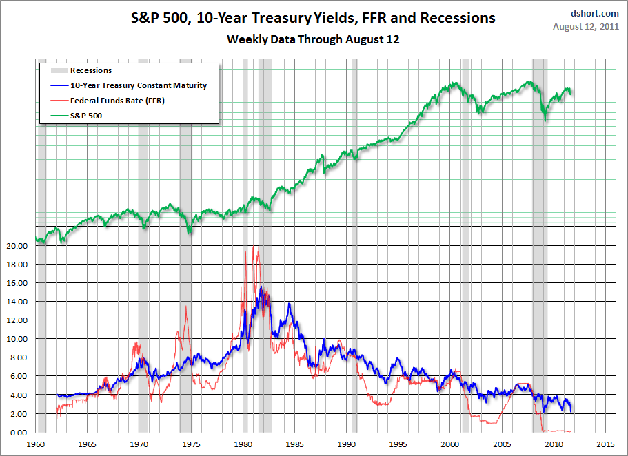
During the recent market tumult, bond yields have once again dropped sharply to very low levels, as seen by the yield on the 10-Year Treasury. A couple of charts illustrate this. First, a weekly long-term chart from 1962 as seen in Doug Short’s August 12 blog post titled “Treasury Yields in Perspective“, with 10-Year Treasury Yields shown in blue:
(click on chart to enlarge image)
–
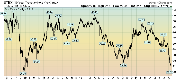
Next, a 3-year daily chart of the 10-Year Treasury Yield:
(click on chart to enlarge image)(chart courtesy of StockCharts.com)
–
While this Bond Bubble may have a little more “upside” left to it, I am of the belief that attempting to derive gains from bonds at this point is akin to “picking up pennies in front of a steamroller” – i.e. there is little to be gained, and much to be lost.
While the Bond Bubble continues, its risks to investors, financial markets and the economy in general has in no way diminished.
_____
The Special Note summarizes my overall thoughts about our economic situation
SPX at 1194.20 as this post is written

