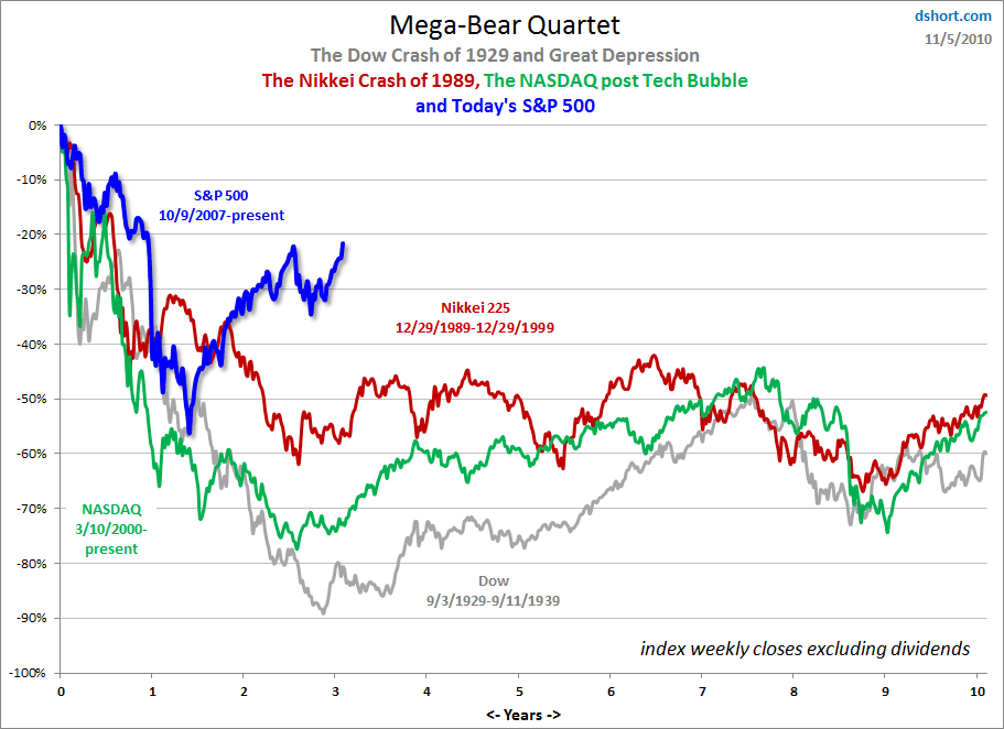
On November 6 Doug Short posted an interesting chart on his site.
This chart shows the post-peak performances, in percentage terms, of four bear markets, as shown.
As one can see, the current trajectory of the S&P500 (post-2007 peak) is quite distinct from that of the post-2000 Nasdaq, post-1989 Nikkei, and post-1929 Dow Jones Industrials:
click on chart image to enlarge
–
There are many different ways to interpret this chart. It should be interesting to monitor on a going-forward basis.
A Special Note concerning our economic situation is found here
SPX at 1213.54 as this post is written
