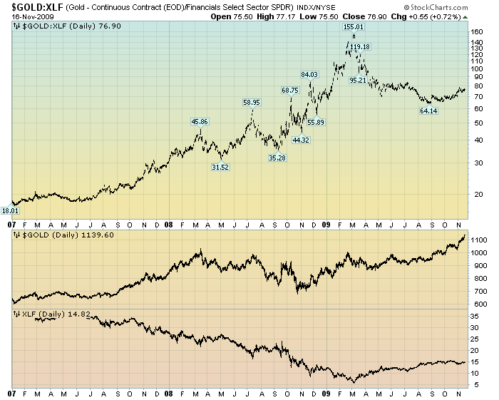
One of the charts that I follow is the ratio of Gold to XLF. As XLF is a prominent ETF of the financial stocks, it can serve as a proxy to “paper assets.”
While I think it is difficult to make concrete conclusions based upon the Gold:XLF chart, I think it does provide a “feel” for some aspects of Gold’s performance.
Here is the daily chart from 2007:
Chart Courtesy of StockCharts.com
In the above chart, Gold:XLF is plotted highest, with Gold and XLF plotted separately below. I find it interesting that while Gold’s price has been performing strongly recently, the peak in the Gold:XLF ratio actually came in March. This seems to cast doubt upon the idea that Gold’s recent strong performance is being driven by its “safe haven” qualities. As I commented in my November 10 post on Gold:
“In effect, could the current strong performance of Gold somehow be a precursor of (more) economic problems? The answer … can certainly be “yes.” However, if so, it would be odd to have Gold rising strongly at the same time low quality paper assets have been rising strongly as well. From a long-term historical perspective, usually Gold’s “safe haven” qualities are most highly valued when “paper” assets are suffering.”
Many people have traditionally viewed Gold as an “alternative” asset – one that should hold its value if other asset values fell. Given Gold’s performance over the last few years, a Gold investor should assess if such an inverse relationship still exists, or if Gold has somehow transmogrified into just another asset that is (highly) correlated with all other assets.
SPX at 1107.02 as this post is written
