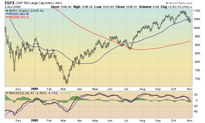
Moving on to the stock market. First, a 1-year daily chart of the S&P500. Although at first glance, the advance from the March lows doesn’t appear too suspect, two aspects are notable. One can see that currently the price has dipped below the 50 day moving average (line seen in blue -the red line is the 200 day moving average) for only the second time since the rally began in March; and second, the MACD indicator along the bottom seems at best lethargic; at worst, it is a significant divergence from the advancing price:
Chart Courtesy of StockCharts.com
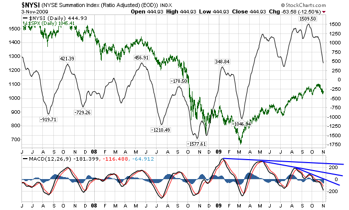
Next, here is a daily chart from ~ mid ’07 of the NYSE Summation Index. I have put in the S&P500 as an overlay in green, with the NYSE Summation Index’s MACD at the bottom of the chart. What I continue to find interesting here is the negative MACD divergence as indicated on the chart, as seen by the blue trendlines:
Chart Courtesy of StockCharts.com
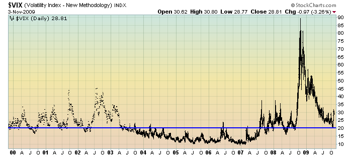
Next is a 10-year daily chart of the VIX. The level of 20 (as seen by the blue horizontal line) on the VIX seems to be a good demarcation of stress. I originally made this observation on September 16, and note how the 20 level seems to have subsequently acted as support.
The VIX has been above this 20 level continuously since early September of 2008:
Chart Courtesy of StockCharts.com
Now on to Part IV…
back to <home>
SPX at 1045.41 as this post is written


