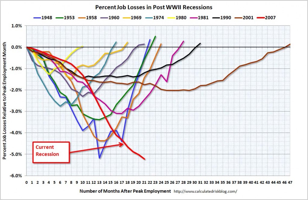
I would like to present an interesting chart on job losses. My last chart concerning job losses was posted on September 10. The commentary I presented there is still highly applicable to the latest unemployment numbers.
This chart is from http://www.calculatedriskblog.com/ from October 2. I like this chart as it presents a depiction of the relative severity of our current period of economic weakness vs. that of prior periods from both a “duration” and “extent” perspective:
There should be no doubt that this unemployment situation is severe, especially in light of the fact that other employment/income options like starting one’s own business in this economic climate would be (very) difficult.
For those who haven’t yet read it, I wrote a blog series titled “Why Aren’t Companies Hiring?” that can be found on the “Blog Series” page listed on the right-hand side of the home page as well as at this link:
https://www.economicgreenfield.com/blog-series/
SPX at 1031.47 as this post is written
