For this last post of this blog series, I will comment on the VIX.
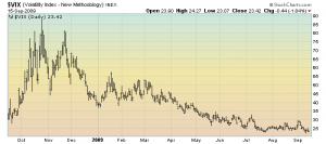
As seen below, if one looks casually at the VIX daily chart, there doesn’t seem to be much to be concerned about:

Chart Courtesy of StockCharts.com
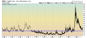
However, I would like to make a couple of observations. First, as one can see, the rate of decline appears to be slowing. Second, as one can see on the 10-year chart below, the level of 20 (as seen by the blue horizontal line) on the VIX seems to be a good demarcation of stress. Not only is the VIX still above 20, but it has been above that level continuously since early September of last year. I think this is signficant:

Chart Courtesy of StockCharts.com
Tommorrow I will summarize my thoughts on this series of blog posts, and indicate where I believe we are heading in the markets. As I stated in the first post of this blog series, I believe we are at a very critical juncture here in the markets.
back to <home>
SPX at 1055.65 as this post is written