U.S. Economic Indicators
Throughout this site there are many discussions of economic indicators. At this time, the readings of various indicators are especially notable. This post is the latest in a series of posts indicating U.S. economic weakness or a notably low growth rate.
While many U.S. economic indicators – including GDP – are indicating economic growth, others depict (or imply) various degrees of weak growth or economic contraction. As seen in the October 2018 Wall Street Journal Economic Forecast Survey the consensus (average estimate) among various economists is for 3.1% GDP growth in 2018 and 2.4% GDP growth in 2019. However, as discussed below, there are other broad-based economic indicators that seem to imply a weaker growth rate.
As well, it should be remembered that GDP figures can be (substantially) revised.
One GDP-based measure that is notable is that of the GDPplus measure from the Federal Reserve Bank of Philadelphia.
Shown below is the most recent update (from September 27, reflecting the GDP release for the 2nd Quarter of 2018, 3rd Estimate). Of note is the divergence between the Real GDP (4.1%*, shown in orange) and the GDPplus measure (2.0%*, shown in light blue):

* the quarter-over-quarter growth rate in continuously compounded annualized percentage points
__
Other Charts Indicating U.S. Economic Weakness
Below are a small sampling of charts that depict weak growth or contraction, and a brief comment for each:
The Aruoba-Diebold-Scotti Business Conditions Index (ADS Index)
While the 2nd quarter GDP (3rd Estimate)(pdf) was 4.2%, there are other broad-based economic indicators that seem to imply a weaker growth rate.
Among the broad-based economic indicators that imply weaker growth is that of the Aruoba-Diebold-Scotti Business Conditions Index (ADS Index.) Below is a two-year chart of the index through October 6, 2018, with a value of -.0323, as of the October 11 update:

source: Federal Reserve Bank of Philadelphia, Aruoba-Diebold-Scotti Business Conditions Index (ADS Index)
__
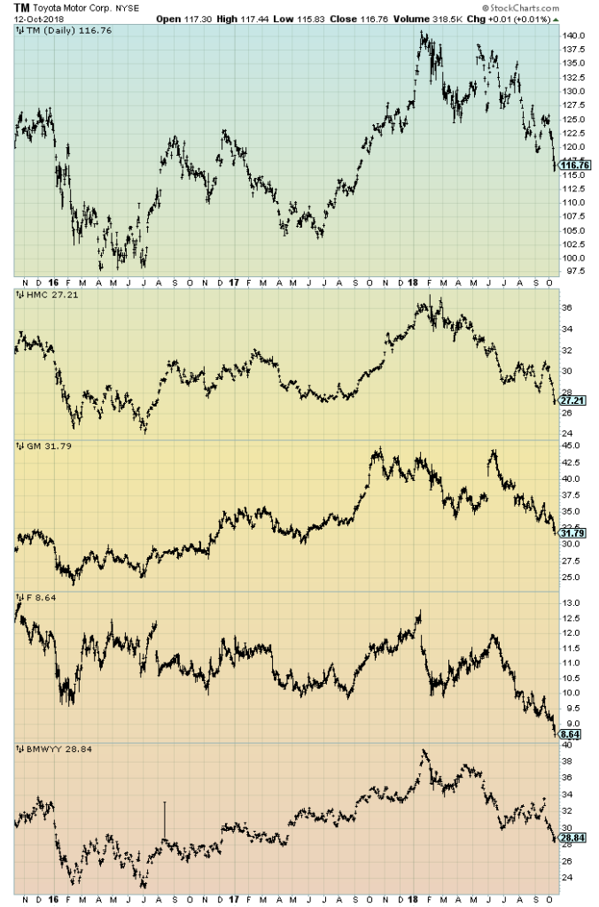
Auto Sales
As discussed in previous posts, I believe that many factors indicate that auto sales have peaked. While this peaking will have extensive economic implications, there are many other factors concerning auto sales that are worrisome. While an exhaustive discussion of the topic would be exceedingly lengthy, various notable factors include the degree to which (ultra-) cheap financing and relaxed financing terms are aiding sales, as well as various aspects of pricing and discounting.
Shown below is a 3-year chart showing the performance of various auto stocks. As one can see, there has been consistent weakness in these stocks (generally) since the beginning of 2018:
(click on chart to enlarge image)(chart courtesy of StockCharts.com; chart creation and annotation by the author)
__
Vehicle Miles Traveled
I continue to find the flagging growth trend in the “Vehicle Miles Traveled” (NSA) measure since 2015 to be notable.
“Vehicle Miles Traveled” through August had a last value of 286,654 Million. Shown below is the measure displayed on a “Percent Change From Year Ago” basis with value 1.2%, last updated October 12, 2018:
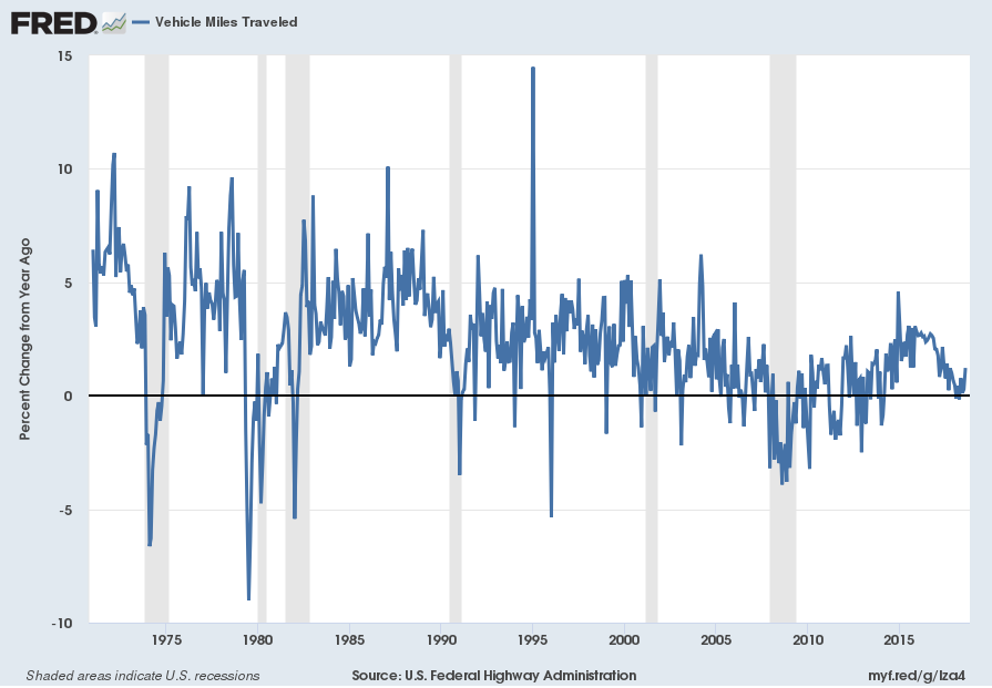
source: U.S. Federal Highway Administration, Vehicle Miles Traveled [TRFVOLUSM227NFWA], retrieved from FRED, Federal Reserve Bank of St. Louis; accessed October 12, 2018:
https://fred.stlouisfed.org/series/TRFVOLUSM227NFWA
__
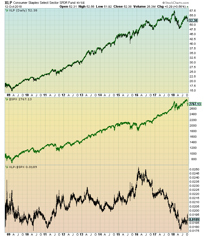
Underperformance Of Consumer Staples Stocks
In the March 23, 2017 post (“‘Hidden’ Weakness In Consumer Spending?“) I wrote of various indications that consumer spending may be (substantially) less than what is depicted by various mainstream indicators, including overall retail sales.
One recent development that appears to be an indication of problems in consumer spending is the performance of the consumer staples stocks. As one can see in the chart below, there has been a marked relative weakness in these stocks (with the XLP serving as a proxy). The chart shows a 10-year daily depiction of the XLP (top plot), the S&P500 (middle plot) and XLP:S&P500 ratio (bottom plot.) While there can be various interpretations and reasons for this underperformance, it does appear to represent a “red flag” especially considering other problematical indications concerning consumer spending:
(click on chart to enlarge image)(chart courtesy of StockCharts.com; chart creation and annotation by the author)
__
Other Indicators
As mentioned previously, many other indicators discussed on this site indicate economic weakness or economic contraction, if not outright (gravely) problematical economic conditions.
_____
The Special Note summarizes my overall thoughts about our economic situation
SPX at 2767.13 as this post is written