U.S. Economic Indicators
Throughout this site there are many discussions of economic indicators. At this time, the readings of various indicators are especially notable. This post is the latest in a series of posts indicating U.S. economic weakness or a notably low growth rate.
While many U.S. economic indicators – including GDP – are indicating economic growth, others depict (or imply) various degrees of weak growth or economic contraction. As seen in the May 2018 Wall Street Journal Economic Forecast Survey the consensus among various economists is for 2.9% GDP growth in 2018. However, there are other broad-based economic indicators that seem to imply a weaker growth rate.
As well, it should be remembered that GDP figures can be (substantially) revised.
Charts Indicating U.S. Economic Weakness
Below are a small sampling of charts that depict weak growth or contraction, and a brief comment for each:
Total Federal Receipts
“Total Federal Receipts” growth continues to be intermittent in nature since 2015. As well, the level of growth does not seem congruent to the (recent) levels of economic growth as seen in aggregate measures such as Real GDP.
“Total Federal Receipts” through April had a last value of $510,447 Million. Shown below is displayed on a “Percent Change From Year Ago” basis with value 12.0%, last updated May 10, 2018:
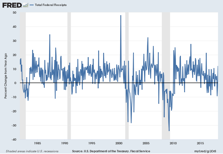
source: U.S. Department of the Treasury. Fiscal Service, Total Federal Receipts [MTSR133FMS], retrieved from FRED, Federal Reserve Bank of St. Louis, accessed May 11, 2018:
https://fred.stlouisfed.org/series/MTSR133FMS
__
Commercial And Industrial Loans, All Commercial Banks
“Commercial And Industrial Loans, All Commercial Banks” through April had a last value of $2162.8113 Billion. The growth in such loans continues to be at a relatively low level. Shown below is the measure displayed on a “Percent Change From Year Ago” basis with value 3.3%, last updated May 11, 2018:
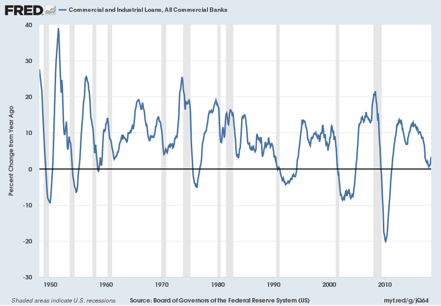
source: Board of Governors of the Federal Reserve System (US), Commercial and Industrial Loans, All Commercial Banks [BUSLOANS], retrieved from FRED, Federal Reserve Bank of St. Louis May 11, 2018:
https://fred.stlouisfed.org/series/BUSLOANS
__
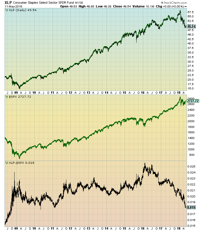
Underperformance Of Consumer Staples Stocks
In the March 23, 2017 post (“‘Hidden’ Weakness In Consumer Spending?“) I wrote of various indications that consumer spending may be (substantially) less than what is depicted by various mainstream indicators, including overall retail sales.
One recent development that appears to be a problematical aspect of consumer spending is the performance of the consumer staples stocks. As one can see in the chart below, there has been a marked relative weakness in these stocks (with the XLP serving as a proxy). The chart shows a 10-year daily depiction of the XLP (top plot), the S&P500 (middle plot) and XLP:S&P500 ratio (bottom plot.) While there can be various interpretations and reasons for this underperformance, it does appear to represent a “red flag” especially considering other problematical indications concerning consumer spending:
(click on chart to enlarge image)(chart courtesy of StockCharts.com; chart creation and annotation by the author)
__
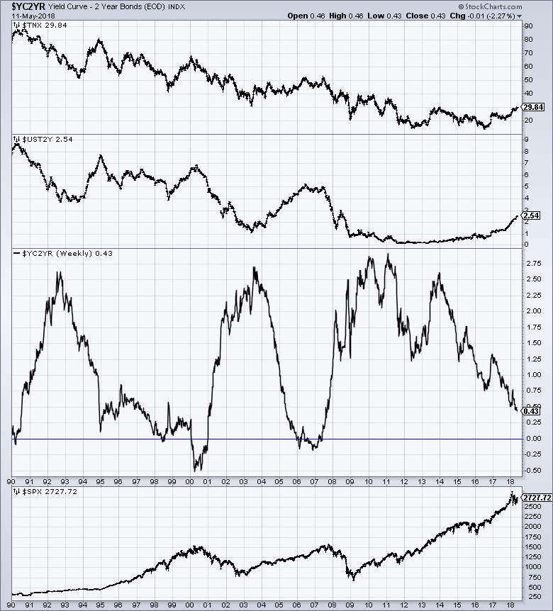
The Yield Curve
Many people believe that the Yield Curve is a leading economic indicator for the United States economy.
On March 1, 2010, I wrote a post on the issue, titled “The Yield Curve As A Leading Economic Indicator.”
While I continue to have the stated reservations regarding the “yield curve” as an indicator, I do believe that it should be monitored.
As an indication of the yield curve (i.e. a yield curve proxy), below is a weekly chart from January 1, 1990 through May 11, 2018. The top two plots show the 10-Year Treasury and 2-Year Treasury yields. The third plot shows the (yield) spread between the 10-Year Treasury and 2-Year Treasury, with the May 11, 2017 closing value of .43%. The bottom plot shows the S&P500:
(click on chart to enlarge image)(chart courtesy of StockCharts.com; chart creation and annotation by the author)
__
Unemployment
I have written extensively concerning unemployment, as the current and future unemployment issue is of tremendous importance.
The consensus belief is that employment is robust, citing total nonfarm payroll growth and the current unemployment rate of 3.9%. However, my analyses continue to indicate that the conclusion that employment is strong is incorrect. While the unemployment rate indicates that unemployment is (very) low, closer examination indicates that this metric is, for a number of reasons, highly misleading.
My analyses indicate that the underlying dynamics of the unemployment situation remain exceedingly worrisome, especially with regard to the future. These dynamics are numerous and complex, and greatly lack recognition and understanding, especially as how from an “all-things-considered” standpoint they will evolve in an economic and societal manner. I have recently written of the current and future U.S. employment situation on the “U.S. Employment Trends” page.
While there are many charts that can be shown, one that depicts a worrisome trend is the Employment Population Ratio for those ages 25 – 54 years. The Employment-Population Ratio is the Civilian Employed divided by the Civilian Noninstitutional Population. Among disconcerting aspects of this measure is the long-term (most notably the post-2000) trend, especially given this demographic segment.
The current value as of the May 4, 2018 update (reflecting data through the April employment report) is 79.2%:
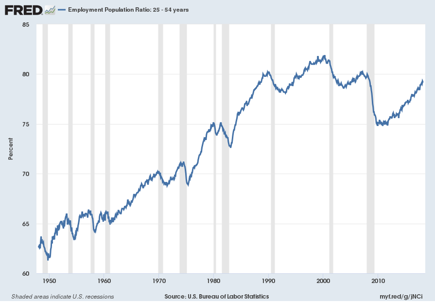
Data Source: U.S. Bureau of Labor Statistics, Employment Population Ratio: 25 – 54 years [LNS12300060], retrieved from FRED, Federal Reserve Bank of St. Louis, accessed May 11, 2018:
https://fred.stlouisfed.org/series/LNS12300060
__
U.S. Auto Sales
U.S. auto sales have experienced significant growth over the post-2009 period as seen in the chart shown below. The current reading (through April) is 17.069 million vehicles SAAR. Of great economic importance is whether auto sales have peaked, which I believe has occurred, as well as other characteristics of the light vehicle market. A long-term chart is shown below:
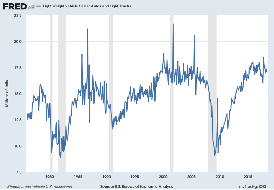
source: U.S. Bureau of Economic Analysis, Light Weight Vehicle Sales: Autos and Light Trucks [ALTSALES], retrieved from FRED, Federal Reserve Bank of St. Louis; accessed May 9, 2018:
https://fred.stlouisfed.org/series/ALTSALES
Here is the same measure on a “Percent Change From Year Ago” measure, with a current reading of .6% . As one can see growth has been intermittent in nature since early 2016:

__
Domestic Auto Production
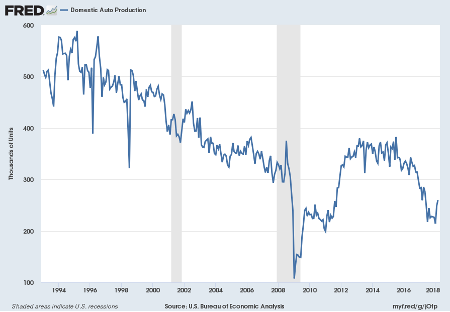
Another notable measure is that of “Domestic Auto Production,” defined in FRED as:
Domestic auto production is defined as all autos assembled in the U.S.
Here is “Domestic Auto Production,” depicted below, through March 2018 with a last value of 260.0 thousand, last updated April 30, 2018:
source: U.S. Bureau of Economic Analysis, Domestic Auto Production [DAUPSA], retrieved from FRED, Federal Reserve Bank of St. Louis; accessed May 11, 2018:
https://fred.stlouisfed.org/series/DAUPSA
__
Other Indicators
As mentioned previously, many other indicators discussed on this site indicate economic weakness or economic contraction, if not outright (gravely) problematical economic conditions.
_____
The Special Note summarizes my overall thoughts about our economic situation
SPX at 2727.72 as this post is written