I have written many blog posts concerning the worrisome trends in income and earnings.
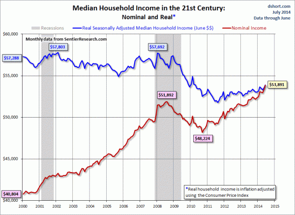
Doug Short, in his July 28, 2014 post titled “Real Median Household Income Rose .69 Percent in June” produced the chart below. It is based upon data from Sentier Research, and it shows both nominal and real median household incomes since 2000, as depicted. As one can see, post-recession real median household income (seen in the blue line since 2009) is especially worrisome.
(click on chart to enlarge image)
–
As Doug mentions in his aforementioned blog post:
As the excellent data from Sentier Research makes clear, the mainstream U.S. household was struggling before the Great Recession. At this point, real household incomes are in worse shape than they were four years ago when the recession ended.
Among other items seen in his blog post is a chart depicting each of the two (nominal and real household incomes) data series’ percent change over time since 2000.
_____
The Special Note summarizes my overall thoughts about our economic situation
SPX at 1978.91 as this post is written