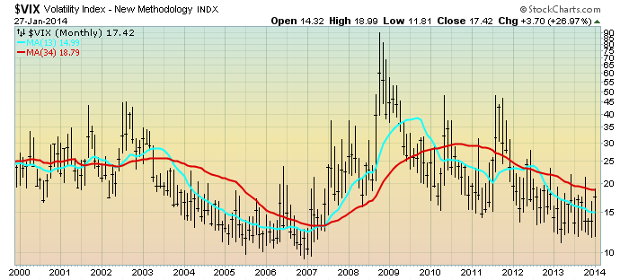
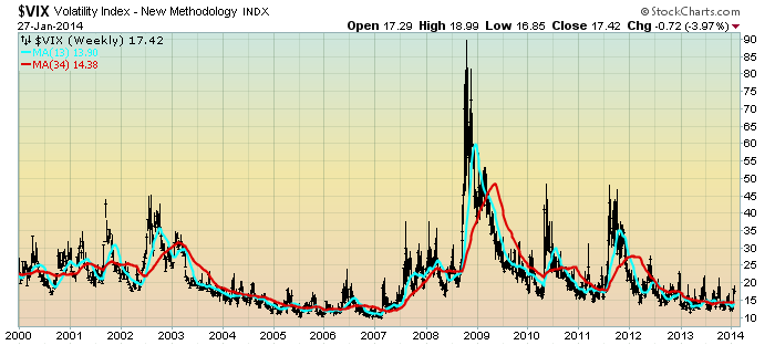
For reference purposes, below are two charts of the VIX from year 2000 through yesterday’s (January 27, 2014) close.
Here is the VIX Monthly chart, depicted on a LOG scale, with price labels as well as the 13- and 34-month moving averages, seen in the cyan and red lines, respectively:
(click on chart to enlarge image)(chart courtesy of StockCharts.com; chart creation and annotation by the author)
–
Here is the VIX Weekly chart, depicted on a LOG scale, with price labels as well as the 13- and 34-week moving average, seen in the cyan and red lines, respectively:
(click on chart to enlarge image)(chart courtesy of StockCharts.com; chart creation and annotation by the author)
_____
The Special Note summarizes my overall thoughts about our economic situation
SPX at 1781.56 as this post is written