This post is the latest update to a series of blog posts seen on the CalculatedRisk.com blog. The original blog post of April 12, 2010, is titled “Recession Measures.” In it, Bill McBride discussed key measures that the NBER uses to determine recoveries, and posted four charts.
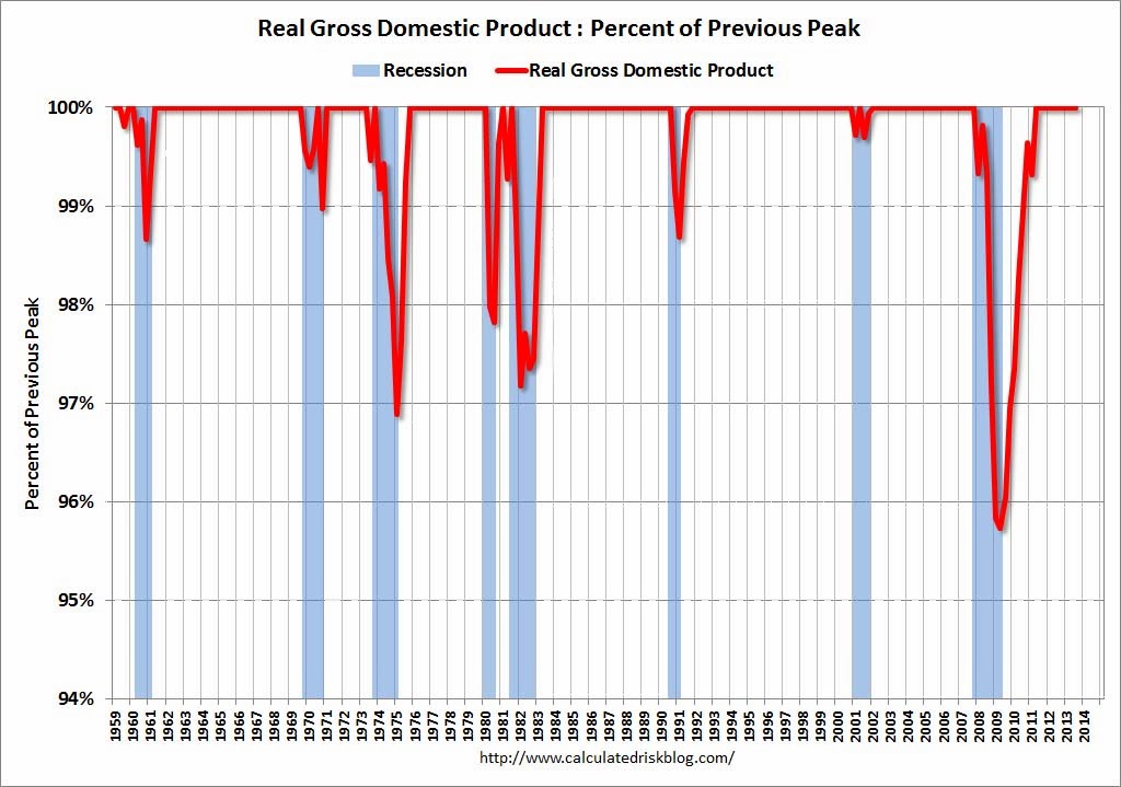
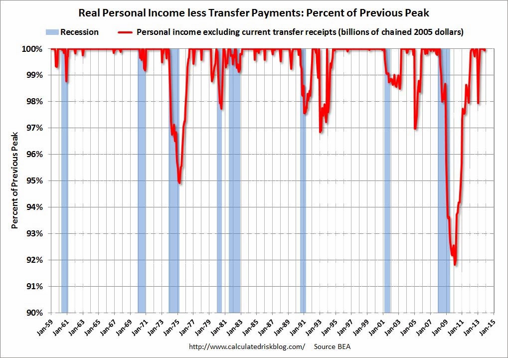
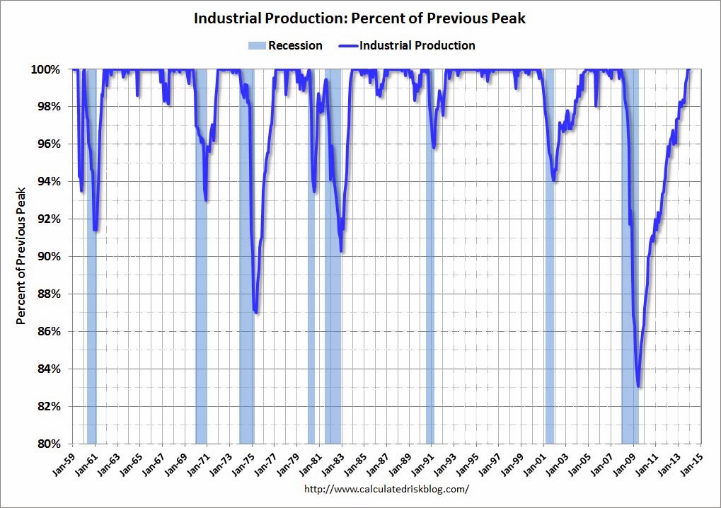
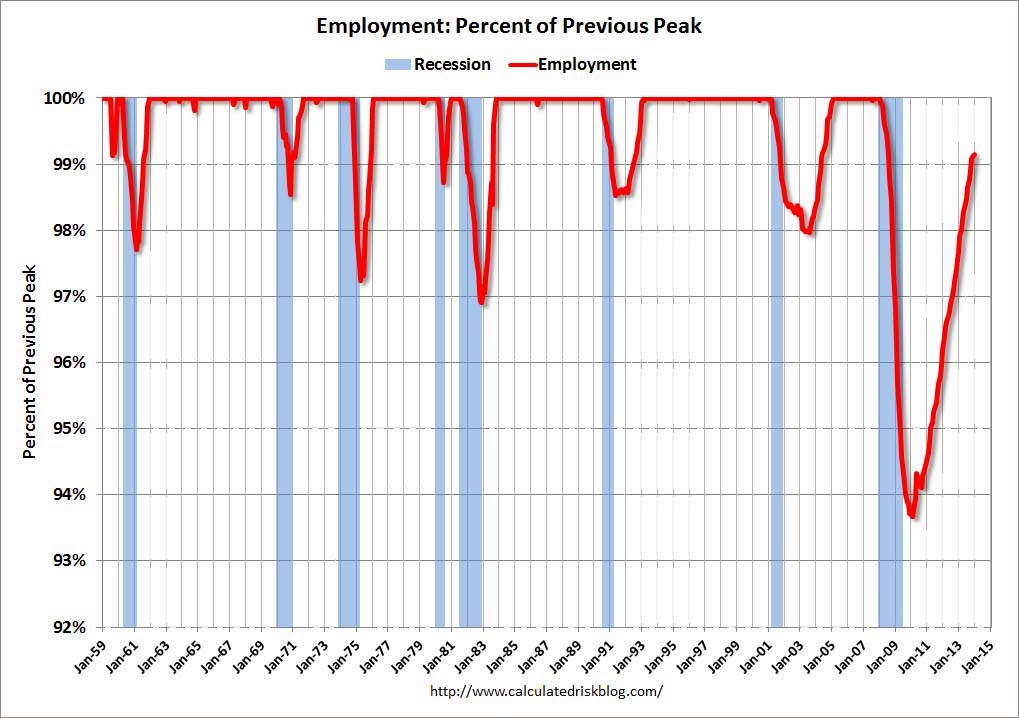
Here are those charts, updated in his January 18, 2014 post titled “Recovery Measures – Three out of Four Ain’t Bad.” The charts are constructed in a fashion different than most – in a “percent of peak” fashion. As defined, “The following graphs are all constructed as a percent of the peak in each indicator. This shows when the indicator has bottomed – and when the indicator has returned to the level of the previous peak. If the indicator is at a new peak, the value is 100%.” Periods of recession, as defined by the NBER, are shown as blue bars.
Here are the four charts, updated through the dates shown:
(click on images to enlarge)
Real Gross Domestic Product, above its pre-recession peak:
–
Real Personal Income Less Transfer Payments, above its pre-recession peak :
–
Industrial Production, above its pre-recession peak :
–
Payroll Employment, still .9% below the pre-recession peak:
_____
The Special Note summarizes my overall thoughts about our economic situation
SPX at 1846.91 as this post is written