U.S. Dollar weakness is a foremost concern of mine. As such, I have extensively written about it. I am very concerned that the actions being taken to “improve” our economic situation will dramatically weaken the Dollar. Should the Dollar substantially decline from here, as I expect, the negative consequences will far outweigh any benefits. The negative impact of a substantial Dollar decline can’t be overstated, in my opinion.
The following three charts illustrate various technical analysis aspects of the U.S. Dollar, as depicted by the U.S. Dollar Index.
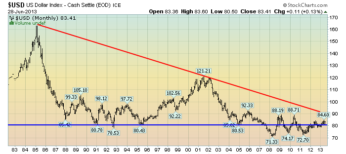
First, a look at the monthly U.S. Dollar from 1983. This clearly shows a long-term weakness, with the blue line showing technical support until 2007:
(charts courtesy of StockCharts.com; annotations by the author)
(click on charts to enlarge images)
–
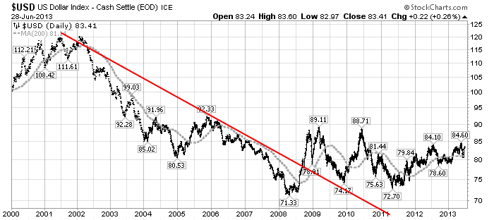
Next, another chart, this one focused on the daily U.S. Dollar since 2000 on a LOG scale. The red line represents both a (past) trendline as well as a relatively good visual “best-fit” line. The gray dotted line is the 200-day M.A. (moving average):
–
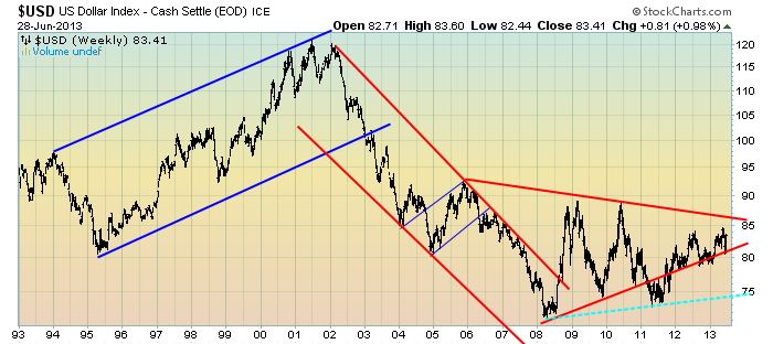
Lastly, a chart of the Dollar on a weekly LOG scale. There are some clearly marked channels, with a potential large, prominent triangle featured (shown with two potential lower trendlines, one red and one dashed light blue line):
–
I will continue providing updates on this U.S. Dollar situation regularly as it deserves very close monitoring…
_____
The Special Note summarizes my overall thoughts about our economic situation
SPX at 1606.28 as this post is written