I have written many blog posts concerning the worrisome trends in income and earnings.
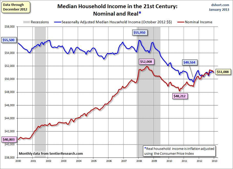
Doug Short, in his January 25 blog post, titled “Median Household Incomes: Down .5% in 2012” produced the chart below. It is based upon data from Sentier Research, and it shows both nominal and real median household incomes since 2000, as depicted. As one can see, post-recession real median household income (seen in the blue line since 2009) is especially worrisome.
(click on chart to enlarge image)
–
As Doug mentions in his aforementioned blog post:
Nominal household incomes rose 1.3% for the calendar year, but adjusted for inflation, household incomes declined by 0.5%. Real household incomes have essentially been flat for the past seven months and are down 7.9% thus far in the 21st century.
_____
The Special Note summarizes my overall thoughts about our economic situation
SPX at 1501.79 as this post is written