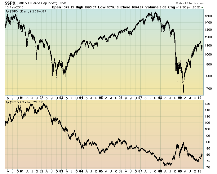
Over the last few years, there has been an inverse correlation between price movements of the US Dollar and many asset classes. This inverse correlation appears to be strengthening over time.
This inverse correlation can be seen in the chart below. For the sake of simplicity, I am only comparing the USD to the S&P500 – but as aforementioned this inverse correlation can be seen among a diverse group of assets.
Here is the 10-year daily chart. As one can see, the inverse correlation appears to have started roughly during 2003, and has persisted to the present:
chart courtesy of StockCharts.com
While this inverse correlation has been frequently commented upon in the media, there are two aspects of this relationship that I have not heard discussed. First, what is causing this inverse correlation? Second, shouldn’t the existence of this relationship cause some unease?
The answer to both of these questions is likely complex. However, I do believe they are very important issues.
back to <home>
SPX at 1094.87 as this post is written
