Occasionally, I have posted charts concerning unemployment. With Friday’s unemployment release, here are three charts that I find noteworthy:
First, from the St. Louis Fed site, the Median Duration of Unemployment.
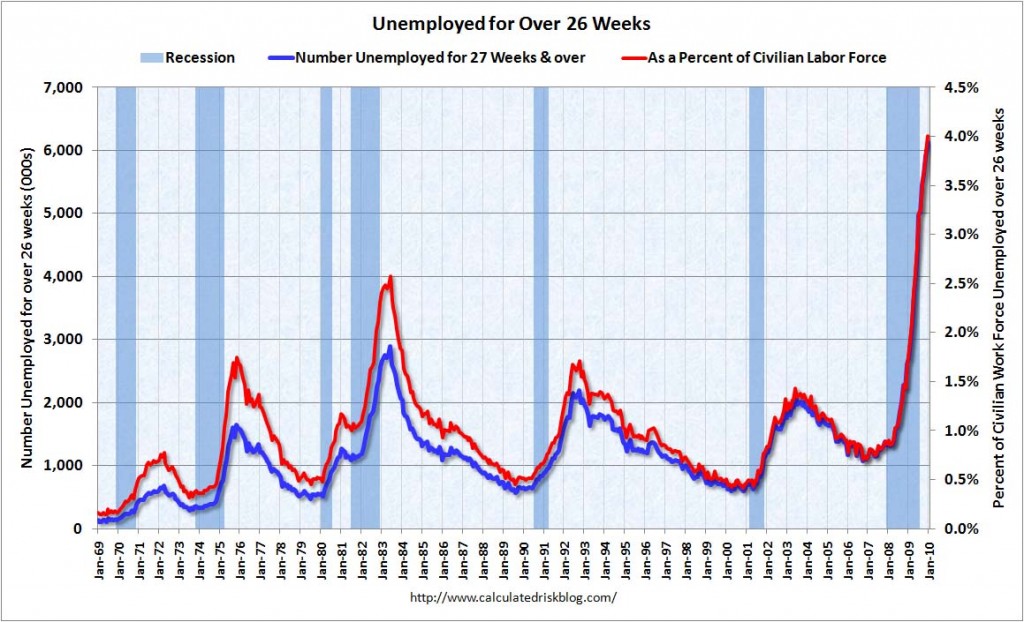
Second, from the CalculatedRisk blog of 1/8/10, Unemployed Over 26 Weeks:
http://www.calculatedriskblog.com/
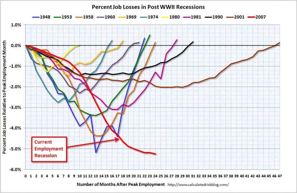
Third, again from the CalculatedRisk blog of 1/8/10 – I like this chart as it presents a relative depiction of Post WWII recession job losses. As one can see, our current period of economic weakness’s job losses are outsized both in duration and severity:
As depicted by these charts, our unemployment problem is severe. Unfortunately, there does not appear to be any “easy” solutions.
A few months ago I wrote a series of blog posts titled “Why Aren’t Companies Hiring?” which can be found at this link:
https://www.economicgreenfield.com/2009/07/24/why-arent-companies-hiring/
SPX at 1141.18 as this post is written


