In the next two posts, I am going to display various charts that I find disturbing. These charts would be disturbing at any point in the economic cycle; that they depict such a dismal situation now – 9 months into what most believe is an economic recovery – is especially notable.
Many more such charts exist, unfortunately. I also regularly discuss many troubling aspects of our economy in this blog.
As well, I find many aspects of the financial markets to be problematical. Those aspects will be covered in the near future.
All of these charts are from The Federal Reserve. Charts in this post are from the St. Louis Federal Reserve. I especially find these charts valuable as they depict our current situation in a longer-term historical context.
Here are the charts:
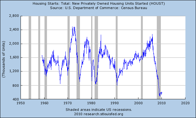
Housing starts:
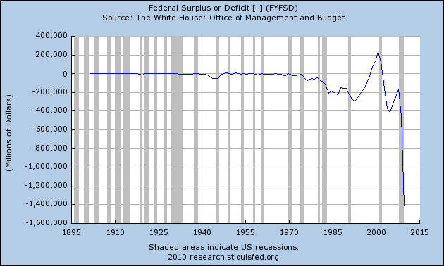
The Federal Deficit:
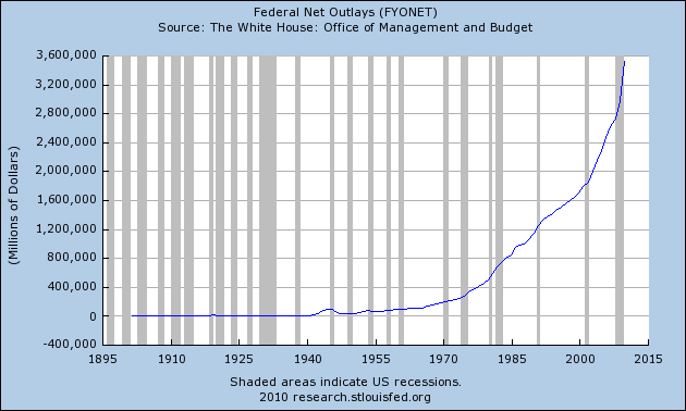
Federal Net Outlays:
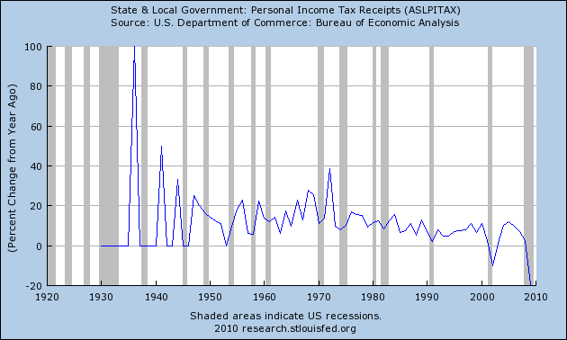
State & Local Personal Income Tax Receipts (% Change from Year Ago):
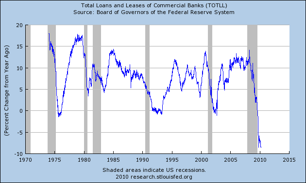
Total Loans and Leases of Commercial Banks (% Change from Year Ago):
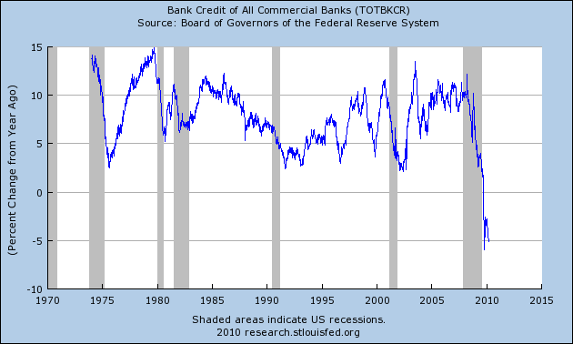
Bank Credit – All Commercial Banks (Percent Change from Year Ago):
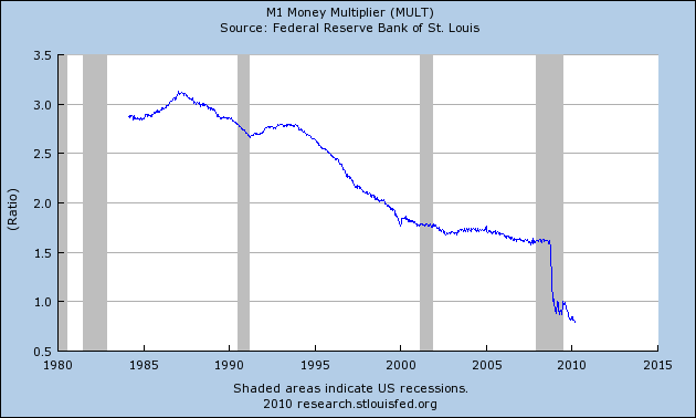
M1 Money Multiplier:
Now, onto Part II…
SPX at 1172.35 as this post is written
